
- Masthead
- Teaser
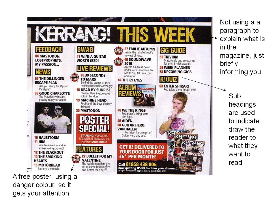
- Images
- Conventions
- bar code
- price
- issue number
- other information ( what else will there be )
Friday, 30 April 2010
Planning and My final Front cover
For my front cover i had looked at other magazine as i said before. i had listed down the things that i thought all front cover magazine all ways have :
Thursday, 29 April 2010
Before and After ( Contents page)

My contents page is completely unique to any other magazine. When i had analyzed any other magazine i had seen to many complicated words being used and to much information on one page. So i had made my contents page easy and straight forward so it will be less complicated for my target audience. my contents page consist of one image of my male model which will be a ' upcoming artist'. The image on the left is the old contents page that i had created which looked plain and the numbers where to close and also the colours that i had used was not the housetyles that i wanted to carry on through out my front cover and the contents page so this is why i had change it to the image on the right and put the name of my artist across the image so the readers will know who is the man and what he will be saying about his music as he is a upcoming artist in the UK. i had chosen my contents page image to be black & white as the other contents page are bright and colourful i wanted my page to be different and straight forward and i also done this so that the information that was in red will be easy to read.
My Final Interview Page

This is my final interview page. As i had told you before i had chosen this design and layout by looking through other magazine this is why i had come up with my final page. My interview page consist of the colour palette of blue and pink this is because i wanted to give it a bright colour feel as the other pages are black , red, grey and white so i thought i would give the interview a unique look to the other pages. i had noticed many other interview pages in the magazine i have annoted one whole side on the right is where the artist image will be, however, i chose to do the opposite to make it a bit unique from the others. I had added a subheader and the name of my artist to let the readers know what this page will be about this will be above the image. on the side of the image there is a pull qoute " my music means the world to me" which was taken out of the interview to reveal to the audience that the interview is about her music, below the quote there 'Aaliyahs' upcoming album underneath that album there is a caption which tells the audience when the album will be released and the name of the album. On the right hand side of the interview page there is another pull quote which is birght and bold so that it is eye catching. Then the interview comes following the questions will be in bright pink and the answers in blue to show the diffrence so it will be easy to read. I had put anotehr image on the left hand corner with a innocent look to my artist which reveals the otehr side to her and the image on the left shows her sophistacted side. On the bottom of the interview there is a teaser which tells us what webiste to go to find out more about 'Aaliyah' and her music industry.
Planning My Interview
The person that my artist 'Aaliyah' who is the main person that will be in the magazine is my friend Mehreen so i had the opporunity at school to ask her as many questions as possible to do with her and the upcoming album that she will be realeasin. The questions that i asked were not boring and formal they were questions that were in 1st person so the readers feel apart of the interview.These are some of the questions that i had asked her: 'Are there any collabiration in the album?' and also ' Congratulations on where you have come Aaliyah....?', however, some of the question that were asked my artist was unable to answer herself so i had to expand on what she had said and made the answers realistic as possible to reveal to the reader that the interview is real.On the other hand, I had not introduced my artist as I had analsyed many other magazine and many of them do not introduce them so i though i would go straight into the interview as my target audience will want to know about her and the album which will be realsed.
Rough layout ( interview page)
On my interview page i had a rough idea of what i wanted as i annotated and analyzed other magazine that was the similar genre as my magazine which is R&B. All of the interview consisted of at least 2-3 images and the interview. So my rought idea for my magazine will be containing a image which will be taking up one whole page which will be on the left hand side and the interview which will be on the left hand side. The layout of the interview will be easy to read and will not be complicated as my target audience are the type of audience which will like the interview easy and readable as the questions will be in a diffrent colour to the anser so they will know whats the question and what is the answer. Also my interview will have a sub heading which will tell us what the page will be about and also the artist name which will be bold and big so that the readers will know who the artist is and will have a idea on what will be coming up.
Evaluating My language choice
For my masthead i had used the word 'Bumpin' this is informal and slang so that it attracts my target audience.
'Bumpin'-My Final Masthead

The name 'Bumpin' orginally came from the saying 'Bumpin and Grindin' . I had not used the word 'grindin' sounds more masculine where as 'Bumpin' sounds very unisex also because it gives the magazine more for the age that i will be targeting at.
I had used this font as it is bold and eye catching aswell as being curvy becuase the word bumpin the letter 'B' is curvy so i though all the letter should be likes this.i had made this more engaging by making the font colour bright red as this will contrast the background . i had chosen this so that it would stand out from the black background the outerglow of my masthead gives it an effect this also blends in with the image which i will be using for my front cover as i used outerglow too . The idea was my original idea because i had googled many other magazine but they were the same as mine big and bold,however, this is why i chose to place it on a black background and placed infront of the image.
I had used this font as it is bold and eye catching aswell as being curvy becuase the word bumpin the letter 'B' is curvy so i though all the letter should be likes this.i had made this more engaging by making the font colour bright red as this will contrast the background . i had chosen this so that it would stand out from the black background the outerglow of my masthead gives it an effect this also blends in with the image which i will be using for my front cover as i used outerglow too . The idea was my original idea because i had googled many other magazine but they were the same as mine big and bold,however, this is why i chose to place it on a black background and placed infront of the image.
Listing Magazine Names
These are few of the names that came to idea when i chosen my genre which is R&B:
- Up-town
- Rhythm
- BASE!
- Bumpin
- Beat again
- Remix
- Stomp
Rough Layout of My Front Cover
I had in rough on a plain white paper sketched out what i would like to want on my front cover and where it should be for expample i wanted my masthead to be bold and big at the top and my image to be in the centre.
Before and After shot Contents page

With this image i had placed my model outside so it reveals the reality of his life. i had positioned him in this way to show that he is a independent artist and is upcoming in the chart. when i had took this image with the camera that i had been using i changed the colour to black & white to give it a unique look to the other images that i had used thorugh out my magazine. With the image on the left i had blurred out the background so my model stands out from the background and my audience will not be focusing on what is behind and at him.I had told my model to where trainers to reveal to the audience he is a young artist in his 16-19 years old. This is the image i had used for my contents page.
Before and After (Front cover)

The image on the left is where i placed my model on a plain white background so that it will be easier to edit on photoshop i had placed her in this position to give the my music magazine a sophisticated look this idea came up from all the R&B magazine i had googled (www.google.com)so it gives me a brief idea on how my final image should look. This is why i transformed my image which know looks like the one on the right. i had cut out my image in photoshop and placed it on a black background i had airbrushed my image by using 'surface blur' so my image looks flawless and maculate. the outerglow of my image is white i had used this so my image is seen to be the main image on the front cover and also so it stands out and looks engaging and appealing to the males aswell as the females.
Before and after shot (interviewee)
 On the left is the orginal image of my model posing for my contents page( Before) i had used a white background so when i edit it on photshop it would be easier for me to cut around my model. I had then edited this image by using photoshop and transformed the picture on the right ( after). I had opend the image up on photoshop and cut around my model then i had fill in the background black, i had surfaced blur my image so this will make my model look airbrushed and cover any marks on her.I had then used blending option to give my image a outglow of white so the image would stand out and give it a effect.
Nme readers profile
 Here is a NME readers profile this shows what gender, age etc the nme magazine will be targetting. This had helped me alot as this gave me a idea on my readers profile for my magazine 'Bumpin'. They had asked the audience whether they use the folowing ipod or cd so this would help them on their magazine so they will know whther there audience would want to win a cd or purchase a itunes voucher so that the readers will be engaged. this gave me a idea as my target audience will be getting a free poster with the 'Bumpin'.
My iconography
 This is a moodboard which shows the iconography that helped me with my magazine as the artist on this moodboard are based on the genre R&B which will support me on mine. the images are mostly black grey and white this is the colours that i had mostly used in my final magazine. some of the artist which are on this moodboard where on my final magazine so that the audience will know that my magazine will be based around the genre R&B.
Test shots

The test shots on the female model i had used a digital camera and placed my model on a plain white background as i was told this will make easier for me to cut my model out and place her any where i like. I had directed my model to stay in the position that i wanted her to stay in and the clothes and accessories that she had worn i had told her to do that as it shows the age that she is and doesn't show that's she is trying to be older as this magazine is aimed at for 16-20 year olds and my model is 16 years old. the image at the bottom of the male i had taken these images outside as i wanted to show that his a upcoming artist and the background will suggest his outside life also the clothing reveals his age and the postion shows that his a confident independent artist . these are few of the images that i had taken that i had used for my music magazine.
Saturday, 24 April 2010
My Final Readers Profile

Here is my readers profile for my music magazine. I had created this table to show everyone the audience that will be reading my magazine and the other conventions they use to purchase music or other things. So the gender my magazine will be aimed at is males and females aged between 16-20 year old who will be in full education and who might have a part time job. The price of my magazine is reasonable ( £1.90) as they are in education and are not earning.
About My Genre
This is a defintion from the urban dictionary from google:Rhythm And Blues. A style of music denotable by its bluesy guitar sounds and deep vocalising, that dates back to about the 1930s. Nowadays the phrase Rnb has been coined by slow rap music, where the actual phrase rhythm and blues is no londer relevant. A general feeling that moaning about someones make believe situations counts as blues, whereas genuine RnB was started during the derpression in america, where the blues were a reflection of human uncertaintey and not the modern day idea of rnb
I had personally chosen this because its one of my favorite genre and i enjoy listening to this type of music also because the celebrities which make these type of music i enjoy reading about them. also the lyrice behind the songs are really good and can be a way to reflect about them and others can listen to it and this can be a way which can realease there emitions or feelings.
I had personally chosen this because its one of my favorite genre and i enjoy listening to this type of music also because the celebrities which make these type of music i enjoy reading about them. also the lyrice behind the songs are really good and can be a way to reflect about them and others can listen to it and this can be a way which can realease there emitions or feelings.
Moodboard
 We was set a task to create a moodboard according to the genre that was help you produce your own magazine. i had browsed through Google different varities of RnB magazines and Hip Hop magazine and chosen the ones that i thought would help me and give me ideas for my own .This had helped me as i realised that many of the magazine had one model that took up the centre of the front cover also that the masthead was underneath the model. So this had helped me as i had chosen to do the same but i out the masthead on top of my model to give it a unique look.
Wednesday, 24 March 2010
Annoted Other magazines


We was put into groups of 5 and was set this task to analyze a magazine that consist of a front cover, contents page and a interview page. We had annotated the page and picked out on what the main things that it should have e.g a contents page should has page numbers and images. This was a task that would help us on our magazine and give us an idea what should be there and what shouldn't. we had also analyzed what the color pallet was through out the magazine as this might be a key feature through out the different issues that were made.
Wednesday, 17 March 2010


Annotated interview
 We had annoted and analysed into depth the jls interview page and picked on the main things that would catch the readers attention and described why it would and also we had analsysed the interview layout and said that it was easy to read as this interview came from a "top of pops magzine" and the target audience for this magazine is between the age of 12-16 so the layout was not confusing and did have informal language to engage the readers. The images taken individually of the members of JLS took up half the page as they was a exclusive interview and the most important part of the magzine. We know this is exclusive becuase on the left hand corner at the top it says " exclusive with a star" to let the readers know this is used throughout the interview pages.
Monday, 22 February 2010
 In my group of three we discussed how Kerrang aim to their target audince by using their reader profile to incorporate this we had then used this as a iconography fvor our own magazine but I the genre of this magazine was not relevant for my magazine,however, I had still used this so it would help me. The readers profile shows that male readers are dominant consumers of the kerrang magazine they are 50% of the audience. The median age for this magazine is 19 year olds this revaeals that they are targetting readers who listen to rock music on a regular basis and that can afford this this is also show through the average albums which are pruchased which is 31 per a month. This magaizine provides the readers with entertainment and information about there bands and about further gigs which will be coming up. The language that is used is informal as it can engage the readers as they are young.


Annotations On NME and RWD
 Here are some of the NME and RWD front covers which I had to analyse the conventions that had been used and I had to also compare between them both the similarities and the differences I had noticed that both of these magazine were different because the target audience were different to one another,however, I had knew this through the color palette they had used. The similarities between these both is that they both had one image that was the main thing on the front cover. They both had teasers, masthead, text. I had used these conventions for my front cover as all magazine have these to make a complete music magazine.


Subscribe to:
Comments (Atom)